Ever stared at a blank wall and wondered how to breathe life into it? Ever wished your window blinds could do more than block out the sun?
You’re not alone.
Picking the right color for your window blinds is like finding that missing puzzle piece. It can instantly elevate an ordinary room into something special, reflecting your personality and style.
I’ve been there too – agonizing over swatches, imagining if ‘Eggshell White’ or ‘Midnight Blue’ would complement my living room better…
This guide will shed some light on this decorating dilemma. You’ll learn about understanding color schemes, considering lighting effects, choosing colors that enhance walls, factoring in furniture and decor, and testing different shades before making a purchase.
And remember, there’s no wrong choice when it comes to expressing yourself! Understand your color scheme.
Picking the right color for your window blinds can be tricky. But don’t worry. With a little understanding of color theory, you’ll make the best choice.
A basic knowledge of primary colors (red, blue, and yellow) is helpful. These are foundational hues from which all other colors emerge. When combined in different ways, they give us secondary colors like green, orange, and purple.
Beyond this, we have tertiary colors – these result from mixing a primary color with its neighboring secondary one on the color wheel. The beauty here lies in creating harmony by picking complementary or analogous shades based on their position on the wheel.
Warm Versus Cool Colors
The next step involves grasping warm versus cool tones, as it’s another critical factor to consider when choosing your blind’s shade.
Warm colors, including reds, yellows, and oranges evoke energy and cheerfulness; they work well for spaces where activity takes place like living rooms or kitchens.
Cool tones, such as blues, greens and purples induce calmness making them suitable for bedrooms or study areas where peace prevails over hustle-bustle.
The Impact of Neutrals
Last but not least are neutrals: black, white & gray. Often overlooked due to their lack of drama compared to vibrant counterparts; however don’t underestimate them. They bring balance into any room decor scheme by providing visual relief amidst bright splashes of color.
For instance, a touch of gray could add sophistication without stealing attention away from the more vivid elements in your space. White, on the other hand, gives a clean and airy feel which could help small rooms appear larger.
So next time you’re faced with choosing window blinds color, take some time to think about these factors. Your choices will not only reflect personal style but also create an environment that resonates with your desired mood and function of each room.
Key Takeaway:
Choosing the right window blinds color involves understanding color theory, including primary, secondary and tertiary colors. Warm tones are perfect for lively spaces while cool ones induce calmness, making them suitable for tranquil areas. Don’t forget neutrals; they add balance and can make rooms appear larger or more sophisticated.
Consider Your Room's Lighting
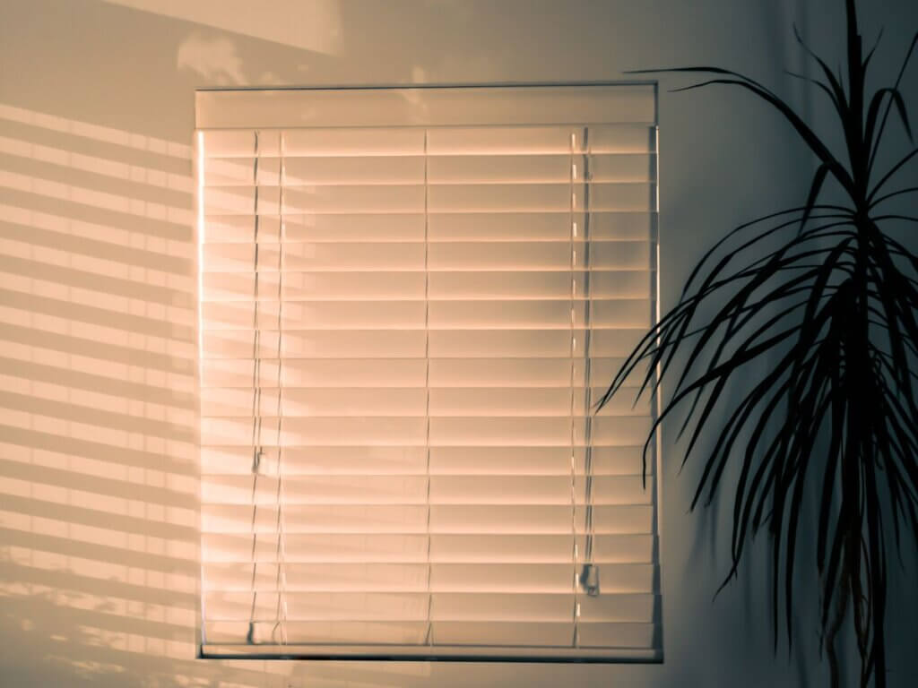
The lighting in your room plays a huge role when choosing the color of your window blinds. Natural and artificial light can change how colors look at different times of day.
Daylight tends to show off the actual shade, yet this fluctuates throughout the day. Morning light may give off a cool blue tone, while evening sun might add warm golden hues. So, consider what time you’ll be using this space most often before making a decision.
Artificial lights also impact perception of color. For example, fluorescent lighting brings out more green tones while incandescent bulbs cast a yellowish hue that warms up cooler shades.
Tips for Matching Blinds Color with Light Conditions
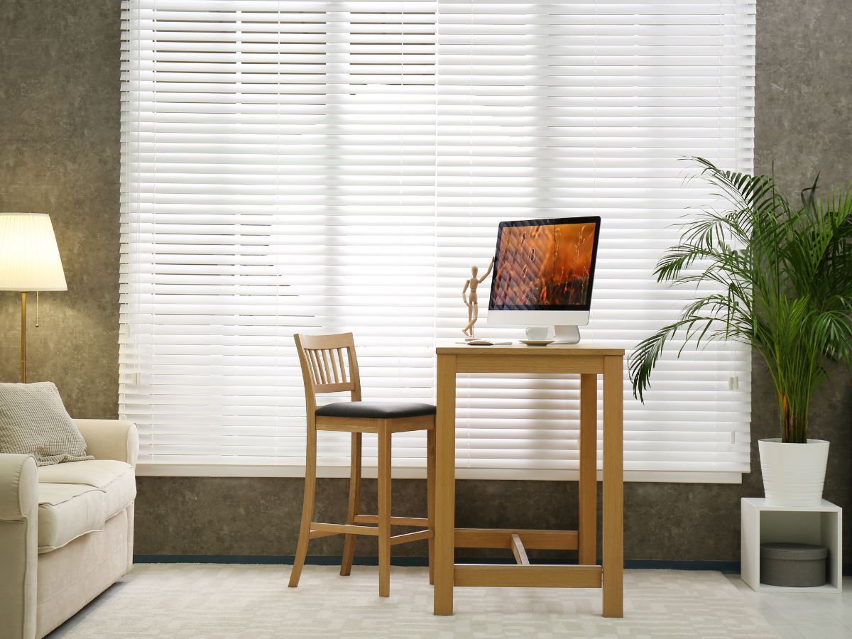
If your room gets lots of sunlight during peak hours, stick with lighter shades to minimize glare and heat absorption. Darker colors could make your space feel hotter as they absorb more heat from direct sunlight.
In contrast, if you have limited natural daylight or rely heavily on artificial lights after sunset, go for brighter or warmer tones like orange or red to help balance the coldness these sources can produce. Studies show these warm hues even boost mood under low-light conditions.
Paying Attention to Window Orientation
Your windows’ direction also affects lighting condition significantly; north-facing ones receive less direct sunshine than south-facing counterparts so take this into account too. If east-facing windows welcome bright morning rays but become dimmer by afternoon—choose versatile neutral-colored blinds that work well under varying light levels all day long. Here’s a helpful guide for more detailed tips on this.
The bottom line? To choose the best window blinds color, you need to pay close attention to your room’s lighting. The right choice will not only look great but also enhance the mood and comfort of your space.
Key Takeaway:
Picking the perfect shade for your window blinds is a mix of room illumination and personal preference. Natural light showcases authentic colors but shifts as the day goes on, whereas artificial lights shape color perception. Rooms filled with brightness gain from softer hues to lessen glare, while dim spaces could do well with cozy tones for equilibrium and mood upliftment. Don’t forget to think about which way your windows face because it changes how lit up they are.
Choose a Color That Complements Your Wall
Picking the right color for your window blinds can enhance the overall appeal of your room. But it’s not always about personal preference. It’s also important to consider how well the blinds’ color will match your wall.
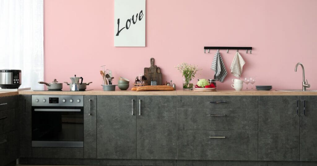
For instance, if you have white walls, going for neutral-colored blinds like beige or gray can add a subtle touch of elegance without overwhelming the space. These blinds can give off an effortless, uncluttered atmosphere.
If you’re dealing with bold-colored walls though, such as red or navy blue, try opting for white or light-colored window treatments. This contrast allows each element in the room to stand out while maintaining balance within the design scheme.
The Impact of Textures
Besides colors, textures play an essential role when choosing window coverings that complement your wall. Wooden blinds, for example, could work great against brick walls because they both possess natural elements that harmonize together effortlessly.
In rooms where wallpaper is used instead of paint on walls, selecting solid-color blinds might be best since patterns from both ends may clash, resulting in visual chaos.
Tips For Choosing The Right Blinds Color Against Your Wall Paint
- To create harmony: choose colors that are close to each other on the color wheel.
- To create contrast: select complementary colors (those opposite each other on the color wheel).
- For a monochromatic look: choose blinds in the same color as your wall but in a different shade (either lighter or darker).
To sum it up, finding the perfect window blinds that complement your walls involves not just matching colors but also considering other factors like textures and room elements. With these tips, you can confidently make an informed decision when choosing window blind colors.
Key Takeaway:
Picking the perfect shade for your window blinds isn’t just about what you like. You’ve got to think about how they’ll jive with your walls too. Got white walls? Neutral blinds in beige or gray can bring a touch of class without going overboard. If your walls are bolder, go lighter on the blinds to keep things balanced. And don’t forget, textures matter a lot too.
Consider Your Furniture and Decor
Your furniture and decor play a significant role in the window blinds color choice. It’s important to make sure your new blinds harmonize with these elements.
Match or Contrast With Furniture
You can either match your blinds with the dominant color of your furniture or opt for contrasting shades. For example, if you have dark wood furnishings, you might want wooden blinds that are similar in tone. But, if there’s a light-colored couch that serves as a focal point, white or cream colored blind could create an appealing contrast.
Mirroring Room Decor Theme
If your room follows a specific theme like coastal or rustic chic, then choosing window coverings that align is key. Coastal themes typically favor lighter hues while rustic ones lean towards earthy tones.
The Role of Artwork and Accessories
A piece of artwork or vibrant accessories can inspire the color selection, too. If there’s art hanging on the wall nearby that has pops of red, why not consider red accents on custom draperies? Remember: smaller details matter.
Incorporate Existing Patterns
Picking up colors from existing patterns, such as rugs and pillows, will help tie everything together seamlessly. This gives off an intentional feel throughout the space.
Remember – it isn’t just about matching exactly; complementing works too. The aim is to create balance without going overboard.
Note: Make use of free swatches services offered by many providers before making any decisions – seeing how different options look under varying lighting conditions at home will give you more confidence in making final choices.
Test Out Different Colors
Picking the perfect window blind color can be tricky. But don’t fret. Here’s a handy trick: testing out different colors before you make your final decision.
Use Color Swatches
To start, get some color swatches from your local hardware or home improvement store. These are usually free and offer a range of shades for each color. You’ll find MITS Eastern Shore helpful in understanding how to choose paint swatches that match your desired blind colors.
Hold these swatches up against both your wall and window during different times of day to see how the light affects them. Make sure you love how it looks at all hours.
Digital Tools Can Help Too.
If getting physical samples is not feasible, use digital tools instead. Many websites let you upload a photo of your room and virtually apply different blind colors so you can visualize what works best with existing decor. Check out this useful Benjamin Moore tool.
A Temporary Solution: Paper Blinds
You might also consider using temporary paper blinds as part of the testing process. They come in various neutral tones, which can give an approximate idea about whether lighter or darker hues would work better for your space without making a hefty investment upfront.
Remember, there’s no rush when choosing the right window blind color. Test, observe, and make an informed decision to ensure you’re happy with the result for years to come.
Conclusion
Choosing the right color for your window blinds isn’t a shot in the dark anymore. We’ve dived into how to choose window blinds color, taking into account various factors.
We started with understanding our room’s color scheme and using that knowledge to find colors that fit perfectly. Lighting came next – acknowledging its influence on our choice of blind colors.
Then we explored how wall colors can be enhanced by carefully selected blinds, adding another layer of texture and depth. And let’s not forget about furniture and decor; they too, play crucial roles in this process.
The journey ended with us testing different shades before making a purchase because sometimes you need to see it yourself!
In conclusion, remember: every decision is an opportunity for self-expression through design! You’re now well-equipped to make confident choices when picking out those perfect hues for your windows.
Ready to transform your living spaces? Let’s bring your vision to life. Contact MITS Eastern Shore today to schedule an appointment and explore the endless possibilities of blinds and wall color combinations. Your dream home awaits.