Spring 2026 is all about refreshing your space with color, texture, and light control. The right shades, drapes, blinds, or shutters—paired with thoughtful color choices—can completely change how a room feels. From soft organic tones to bold contrasts, this guide highlights seven colors that work beautifully across spring window treatments, while helping you balance privacy, sunlight, and overall comfort.
Why Color Matters in Spring Window Treatments
Color is more than style—it affects how your space feels throughout the day. The right palette can:
- Soften harsh sunlight
- Enhance natural brightness
- Improve perceived warmth or coolness
- Complement layering with linen, cotton, or bamboo textures
When paired with functional upgrades like motorization, cordless systems, or thermal and blackout linings, color becomes both aesthetic and practical.
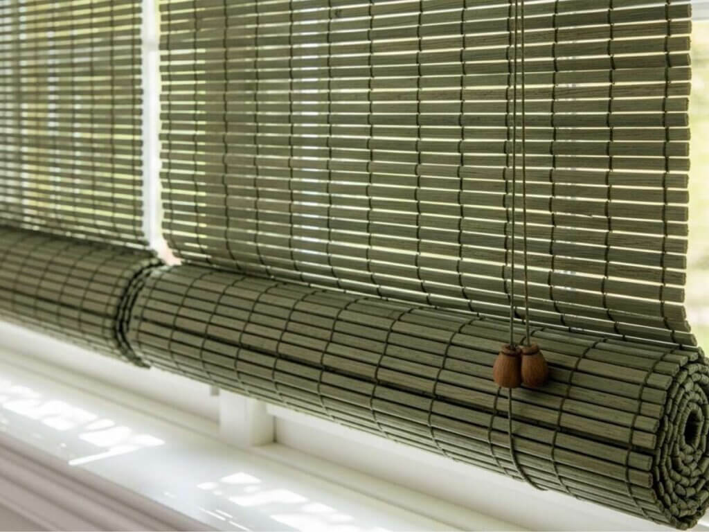
1. Soft Sage Green
A Natural Reset
Sage green brings an organic, calming tone that pairs well with bamboo weaves, hemp fabrics, and roman shades.
Best used for:
- Woven wood shades or bamboo blinds
- Layered drapes with light-filtering sheers
- Spaces needing a relaxed, nature-inspired feel
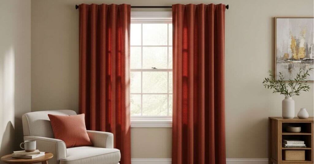
2. Warm Terracotta
Earthy and Inviting
Terracotta tones add warmth without overpowering a room. Ideal for spring window treatments that need depth.
Works well with:
- Cotton or velvet drapes
- Pleated roman shades
- Decorative valances or cornices
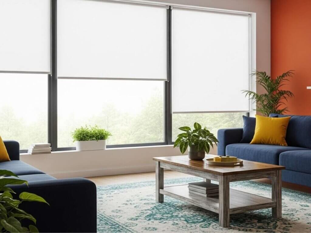
3. Creamy Linen White
Bright Without Being Stark
Pure white can feel harsh. A creamy linen tone softens the look while maintaining brightness.
Perfect for:
- Ripplefold drapes on sleek tracks
- Solar shades or rollers
- Layering with blackout panels for bedrooms
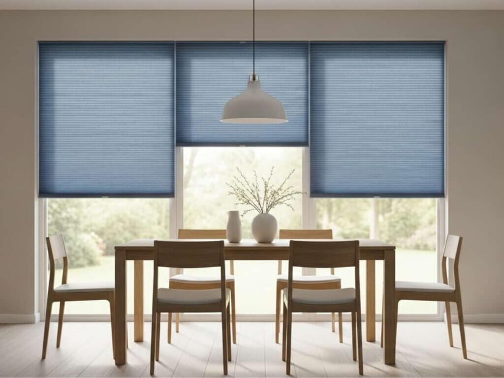
4. Dusty Blue
Calm and Balanced
Dusty blue tones help reduce visual clutter while maintaining a clean, modern look.
Ideal applications:
- Honeycombs or cellular shades
- Cordless blinds for a streamlined finish
- Bedrooms where light control and calm matter
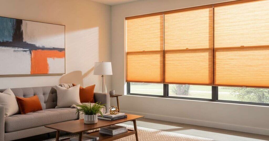
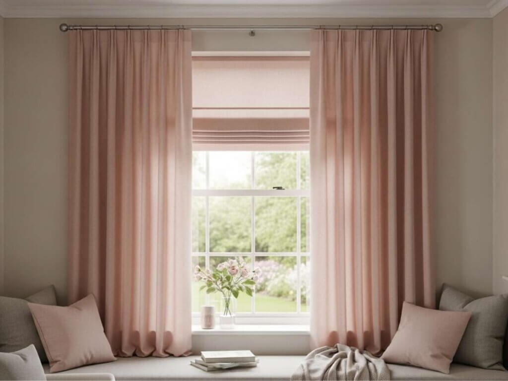
5. Blush Neutral
Subtle Warmth
Blush tones are versatile and pair well with natural textures like cotton and linen.
Best for:
- Drapery panels with soft pleats
- Layering with sheer shades
- Spaces needing a gentle color lift
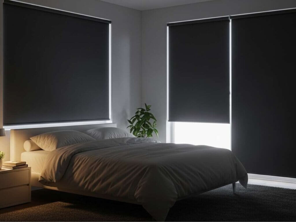
6. Charcoal Gray
Modern Contrast
Charcoal adds depth and contrast, especially in rooms with large windows or open layouts.
Use with:
- Blackout shades for better light blocking
- Motorized window treatments for a sleek, automated feel
- Shutters for a bold, architectural look
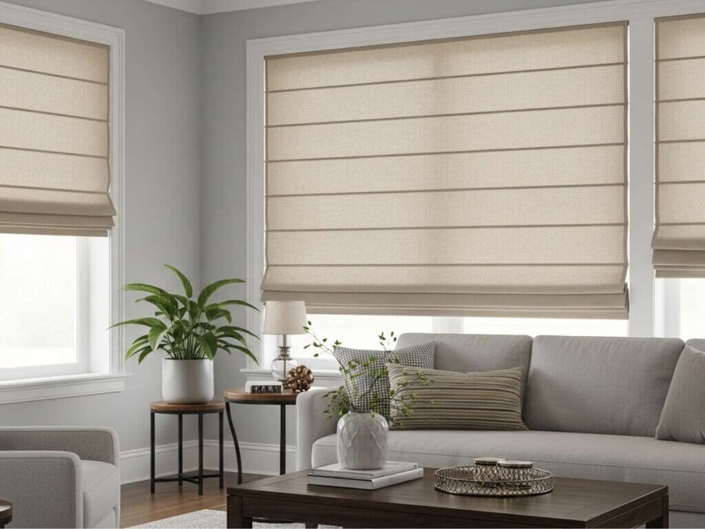
7. Sand Beige
Effortless Versatility
Sand tones blend easily with almost any interior, making them a safe yet stylish choice.
Great for:
- Roman shades with textured weave
- Solar or thermal shades
- Pelmets or structured cornices
Quick Color Pairing Guide for Window Treatments
Color | Best Materials | Ideal Rooms |
Sage Green | Bamboo, hemp | Living rooms |
Terracotta | Cotton, velvet | Dining areas |
Linen White | Linen, sheer fabrics | Bedrooms |
Dusty Blue | Honeycombs | Bedrooms, offices |
Blush Neutral | Cotton blends | Guest rooms |
Charcoal Gray | Blackouts, shutters | Media rooms |
Sand Beige | Solar, roman shades | Whole home |
Layering for Better Results
Color works best when combined with layering. This approach improves both design and function.
Consider layering:
- Sheer + blackout drapes for flexible light control
- Roman shades + side panels for added depth
- Blinds + valances for a finished look
Layering also helps address common concerns like glare, privacy, and insulation—especially during changing spring temperatures.
Frequently Asked Questions
1. What is the best color for brightening a room?
2. Are darker colors good for window treatments?
3. How do I choose between warm and cool tones?
4. Do colors affect energy efficiency?
5. Can I mix multiple colors in one room?
Bringing It All Together
Refreshing your window treatments for spring doesn’t require a full redesign—sometimes, the right color makes all the difference. Whether you prefer soft organic tones or bold contrasts, combining color with the right materials, hardware, and features like motorization or cordless operation can completely change how your space feels. Thoughtful layering and texture choices help ensure your windows look polished while still performing well throughout the day.
If you’re planning to update your spring window treatments, working with a professional like MITS Eastern Shore can help you choose colors, fabrics, and systems that truly fit your home. From selecting the right shades or shutters to integrating automated solutions, expert guidance makes the process smoother and more effective.
Ready to refresh your windows for Spring 2026? Schedule a free consultation and explore custom solutions designed around your space, style, and everyday comfort.