Drapery color can shape how you feel in a room. Specific colors evoke emotional responses rooted in psychology and cultural associations. Those effects can subtly shift a room’s mood when used in your window treatments, particularly drapery, which often makes a bold visual statement.
From energizing reds to calming blues, the color of your drapery can influence your mood, behavior, and overall well-being. Learn how to choose a drapery color that complements your décor and supports the atmosphere you want to create at home.
Practical Steps: How to Choose Drapery Color for Your Mood
1. Consider the Purpose of the Room
Each space in your home serves a different function, and your drapery should support that purpose.
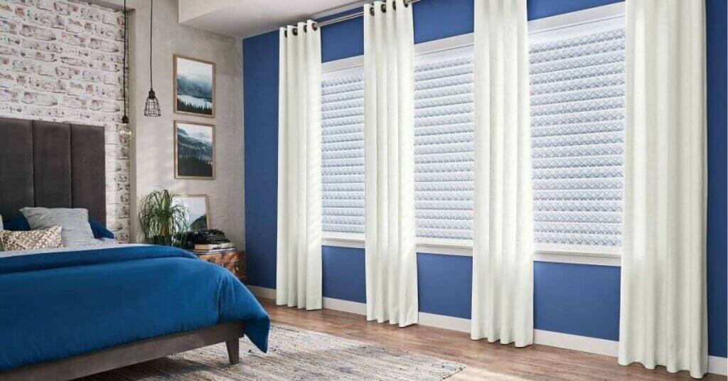
Bedrooms benefit from calming, restful tones like soft blues, muted greens, or gentle grays to encourage better sleep.
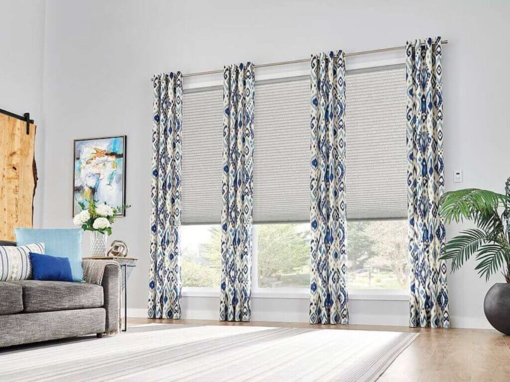
Living rooms often balance energy and comfort—earth tones or warm neutrals can create a welcoming space for guests.
Home offices thrive with colors that enhance clarity and productivity, such as sage green or slate blue.
Tip: Think of drapery as part of your daily mood-setting ritual. It frames how you start and end each day.
2. Identify the Mood You Want to Promote

Ask yourself: How do I want to feel in this room? Energized? Relaxed? Focused? Your answer can help guide your palette.
- Calming: Soft neutrals, pale blues, dusty pinks
- Energizing: Mustard yellow, coral, tangerine
- Cozy and grounded: Rich browns, olive green, warm grays
- Refreshing: Cool greens, seafoam, aqua
Choose drapery colors that echo your desired mood, not just the current trends.
3. Pay Attention to Natural Light
The light filtering through your windows changes how colors appear throughout the day. A shade that looks crisp white in the morning may feel beige by dusk.
Rooms with abundant sunlight can handle deeper or cooler colors.
Dimmer rooms may benefit from warmer or lighter tones to boost brightness and comfort.
Fabric weight also impacts how the color interacts with light—sheer drapery softens hues, while heavier fabrics deliver bolder color statements.
4. Work with Existing Décor and Finishes
Your drapery should feel cohesive with the rest of your room.
- Look at your furniture, wall color, flooring, and artwork. Choose drapery colors that complement or anchor these elements.
- Monochromatic schemes (different tones of the same color) can feel elegant and serene.
- Contrasting drapery can make a space feel more dynamic, but be mindful of clashing tones.
5. Use Color Associations Mindfully
Color psychology can be subtle but influential. Here’s a quick reference to guide your decision:
Color | Common Mood Association |
Blue | Calm, clarity, trust |
Green | Balance, renewal, nature |
Yellow | Happiness, optimism |
Gray | Stability, neutrality |
Red | Passion, energy |
Beige | Warmth, comfort |
Choose with intention. You don’t need to follow strict rules, but knowing these associations can help create an ambiance that aligns with your goals.
6. Think Seasonally—but Not Too Literally
Eastern Shore homes experience all four seasons, so leaning into seasonal color palettes is tempting. However, choosing a base color you’ll love year-round is best.
If you want flexibility, consider layering with seasonal accessories like pillows or throws instead of changing your drapery regularly.
Industry Insights: Tips and Traps to Know Before You Choose
Don’t Underestimate Undertones
A beige with a pink undertone can clash with a yellow-based neutral, even if both are “warm.” Always compare fabric samples in your space and during different times of the day.
Avoid Overly Trendy Shades
Going with what’s popular this year is tempting, but drapery is an investment. Unless you plan to update it regularly, choose a color that reflects your personal style and stands the test of time.
Consider Fabric Texture and Finish
A velvet panel and a linen drape can feel worlds apart, even with the same hue. Texture affects how a color is perceived—matte fabrics soften intensity, while glossy ones amplify it.
FAQs About How to Choose Drapery Colors in Eastern Shore
What's the best drapery color for small spaces?
Lighter colors—like soft whites, pale blues, or muted greens—help open up small rooms by reflecting more light and creating an airy ambiance. Avoid heavy, dark fabrics unless you aim for a dramatic or cocoon-like feel.
I live near the coast. Should I choose drapery colors that reflect a beach vibe?
Coastal-inspired hues like seafoam, sand, and driftwood tones work beautifully in the Maryland and Delaware beach communities. They’re soothing, timeless, and blend naturally with the surrounding landscape. But it’s okay to mix in bolder tones for personality.
Will colorful drapes fade in sunlit rooms?
Prolonged exposure to direct sunlight can fade any fabric over time. Choose UV-resistant materials and consider lining your drapes for added protection. Sheer layers or solar shades behind your drapery can extend their lifespan without sacrificing aesthetics.
Let Your Mood Shape Your Design
Drapery does more than decorate—it helps define how a room feels. Whether you’re seeking calm in a busy home, creativity in your workspace, or comfort in a gathering space, your color choices matter. Be mindful, trust your instincts, and let your windows reflect the mood you want to come home to.
Request a consultation today with Made in the Shade Eastern Shore to explore custom drapery options tailored to your space, lifestyle, and emotional design goals. Let’s bring color psychology into your window treatments—beautifully and purposefully.